Character Animation Through the Puppet Method

Homework giving you a headache? Math gives you a migraine? Can't quite figure out how to do something in photoshop? Never fear, the other members of CAA share their expertise in this forum.

Character Animation Through the Puppet Method

Postby Dante » Fri Jan 04, 2008 6:56 pm

VG ANIMATION TUTORIAL 1
EASY ANIMATED FRAMES WITH PUPPET LAYERING TECHNIQUE
By: Pascal

This is just some random intro junk I felt inspired to write, those in the art design contest, I assume you have some means of creating art skip to the *****


Alright, so you’re interesting in creating a video game, just for kicks and giggles, but the problem is where do you start? Ok, so maybe that’s a little to big a topic for this tutorial, but might I make a suggestion? Games are, at least in general, a world of graphical elements. We don’t play main characters and manipulate objects that are sounds, or smells or feelings or even tastes. While this would be original and I would have to admit fertile untouched ground for game design, it stands contrary to what is emphasized the most in games today… art.

Game art, or the artwork we see in the video games we play, whether as a 3-D character model, a vast forest or an item interface, is the primary emphasis of the modern gaming industry. While it can be said that a good game must be fun and have good “game design” and a great soundtrack would be nice, this has not generally been shown in the window frame of public perspective. Time after time, consoles are released and judged upon their graphical output, their ability to produce sharper, clearer, more appealing images then the generation previous and their competition. Sad though it is, you never hear about the latest sound card installment on the PS3 and apparently programming was worthless because it has been said that programming on the same said system is also horribly difficult (Thus the lack of games). At the same time, producing game art for modern consoles is not only beyond the scope of this paper, it is frankly beyond the means of the readers of this paper… but cheap small scale art for little fun games is not! I think…

The tools I claim every game animator needs are as follows…
A computer (Check)
A pencil with an eraser
Paper
A scanner (Can be found at a library or local school)
Some form of layer based graphical program (See below)

So the main idea is to stay cheap, and frankly, while WAMCOMs and Photoshop are nice, they are also expensive… which is why I lack a drawing tablet… I draw with a mouse… I do draw a lot though, so I also did get a scanner… which doubles as a copier and a printer and split the cost with my folks. And because I do it a real LOT I also shelled out about 30 bucks on Paint Shop Pro 7 and Photoshop Elements (also 30 bucks). Trick here, ALWAYS wait for a sale and ALWAYS make sure you know what you’re getting, shop and understand the market well enough that you KNOW when you’re getting a screaming deal. Also expect to hastle and do battle royals over rebates and small print. If the paper doesn’t mention you need another version of the program because it’s an “upgrade rebate” but you find out in the small print of the REAL rebate that it is just such a rebate after the fact… I give you permission… no I COMMAND you to go back and demand your money personally from them (What would they do if you grabbed 30-40 bucks from their cash register and walked off with it?)… But try to find the deals at first that don’t require an upgrade rebate. This is just a general statement of running the personal economics of your life, not just for this. Oh and either Safeway or Frys (I forget which, but I think it’s Frys) will allow you get any item for free if you catch them making a mistake when charging you for the item. So if you’re charged 4 bucks and the sign where you purchased it said 3, cha ching! ALWAYS check your receipt, because supermarkets love to rip ya off this way, and my mother and I have always found that it’s always in their favor (Gives conspiracy look at supermarkets). (Happened AGAIN the day after I wrote this paper)

But hey WAIT!!! Before you go running off to buy things, hold on a minute! If you don’t have the above then don’t go off shelling out money, you’re an artist and remember this gig isn’t being done for the money, we’re FREE ARTISTS, or perhaps even starving artists. The programs I’d recommend instead are ones like The Gimp or Paint.NET. (This way you don’t have to eat Raman noodles for a month to enjoy creating art) These FREE alternatives to the already cheap retail versions (when on sale) are PERFECT for the type of things we need to do, and should allow you to produce just about everything I’ll put in these tutorials (If I can get time and make more)… In fact it will do everything in this tutorial! Thus, please don’t go out and buy them on account of me, the main thing at the moment is a pencil and paper… and I really hope that as an aspiring artist you have some form of pencil and paper, it doesn’t have to be a fancy pencil (to this day I use the cheapest mechanical pencils I can get my hands on from the back to school sales, so you’re not alone) nor fancy paper (up until recently I only used computer printing paper). Now, once you’ve got a game plan together we’re now going to talk about creating game art! Aren’t you excited!

*****


This Tutorial is about creating animations quickly. The bane of most individuals looking at a video is that disturbing question, how do I create all the frames for animations?! Now if you didn’t know animations are really just a psychological trick played on humans because we perceive rapidly changing images as continuous motion. They prove to be a problem because the traditional way of creating them before computers was to laboriously draw out each VERY similar frame by hand. Once light bulbs were invented I suppose light-tables reduced the difficulty of this task by allowing you to draw an image once, and then place the one image underneath the other one and then simply trace the parts that remain the same and use the other parts as references for new changed segments… beautiful as these are, you still need to ink and color each of these images by hand and all in all it turns out to be a lot of work! Plus, lightable are expensive, depending on when and where you get them, they may cost even more then a version of Paint Shop Pro or Photoshop Elements… Thus we won’t be using one for this tutorial!

With this history in hand I now present a faster albeit less beautiful way to create you animations through use of computers and layers. This technique or the puppet technique allows you to make as many frames with as many manipulated details as your heart desires using only ONE complete highly detailed drawing! This is what makes it so perfect, also once completed the act of creating all the frames is rather simple and streamlined just waiting for reuse in case you wanted to create even more animations using the single drawing!
FKA Pascal
User avatar
Dante
 
Posts: 1323
Joined: Thu Mar 04, 2004 8:24 pm
Location: Where-ever it is, it sure is hot!

Postby Dante » Fri Jan 04, 2008 7:13 pm

The basic idea of what I’m going to do can be summed up in only a few words (thus the huge intro to make this tutorial LOOK impressive). I am going to draw a character by hand and scan them into the computer at a fairly high resolution. Then I’m going to create a ton of layers, in fact I’m going to create ONE layer per element segment connecting each moving joint (Perfect for humans where you can have a front upper arm, a neck, a front upper leg, stomach, ect.) Then, after naming the layers to simplify ordering (and ordering layers from front to back according to which segment is closest to the camera at that time), I’m going to ink each layer and do BASIC coloring (one primary color per connected region). The inking is basically a trace of what’s underneath on the bottom most layer (the original scanned in picture) making the task of drawing as simple as tracing. As each named layer corresponds to the elements drawn in them, (with behind drawing… you’ll see why) the act of animating becomes as simple as moving each named element (frame) and rotating that frame to it’s desired position for that frame. Save this NOW in the native format to the layered program and then do a quick save at each frame in collapsed bitmap form to create each frame. Test it out in an animation program and your done!

Got that? WHAT?! And I thought I was a perfect teacher! Well maybe an example of the theory would be nice wouldn’t it? Ok, then lets’ follow the steps in one of my latest creations a small worthless soldier character. Create him in masses and have him run up and fire a stream of bullets before falling to the blade of your character… but don’t worry you can create many many duplicates of this unit in your game army! Bwah ha ha hah!

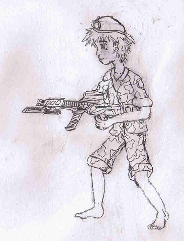
Step 1: Create and Scan your image

Image
Sample image 1
Ok, so after much hard work you’ve drawn your image! Here are some tips!:

1. Make sure that the drawing is in pencil and nothing is shaded. You’ll ink and shade the character on the computer.
2. Also draw the character in a fairly plain stance, generally the first standing stance that is seen when the character isn’t doing anything (That’s what they’ll be doing most of the time… not’in!). You want to be able to draw clearly each rotatable limb on the computer as easily as possible when you scan it in.
3. Also, please draw the character from the perspective you’re going to use for the game!
4. Scan your image in at a fairly high resolution like 150 or 300 dpi. I know you’re not going to USE the character at this resolution in the game but it’s a trick! When you reduce the character size for the game in the game, it will throw out a lot of stuff from the original drawing AND it will merge a lot of colors. This works out to your advantage because it looks like you made pixel by pixel adjustments to your drawings and often times a lot of the mistakes you’ll make will vanish when the image is reduced in size!

(Remember to save in a layer using format!)

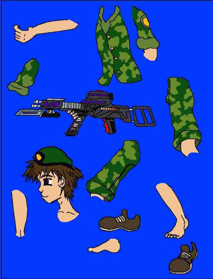
Step 2: Create layers for each segment of the character which will be animated INCLUDING OUTSIDE OBJECTS (E.G. Swords, or in this case the big gun he’s holding, anything that can be interchanged makes for easy bad guy or character weapon change, imagine if I drew up a bazooka, scanned it in and just replaced this gun with a bazooka, WHAT AN EASY NEW BAD GUY!).

For a standard human character he’s a basic rundown list which makes the job easier. Also note that the list is in order for a side scroller game meaning that the top-most layer is the layer that is seen first for this character, that way should one segment move in front of the other, they don’t look “weird”.

Front Top Arm
Front Bottom Arm
Front Hand (Optional if you want to move the hand around)
Head
Neck (You’d be surprised just how useful a separate neck element can be)
Torso (Can be split into an upper torso and a stomach if you want
Front Upper Pants/Upper Leg (Basically everything from the knee to the waste)
Front Lower Pants/Lower Leg (From the knee to the top of the foot)
Front Foot
BACK Upper Pants/Upper Leg (Basically everything from the knee to the waste)
Back Lower Pants/Lower Leg (From the knee to the top of the foot)
Back Foot
Back Top Arm
Back Bottom Arm
Back Hand (Optional if you want to move the hand around)

That means that for a human being there are roughly 15 major components necessary to create a puppet model! Note that the eyes or mouth will be easiest to do as edits when you reduce the size of the animation because the lower lid of the eye can be inked and a blink can be done by simply coloring a skin to over the whole eye in one frame. Create several standard mouths in various forms to create a loop for talking (it doesn’t matter if their lips match what they’re saying, we’re already used to the mismatch from anime :P).

(Remember to save in a layer able format!)

Image
Image 2

Image
Image 3

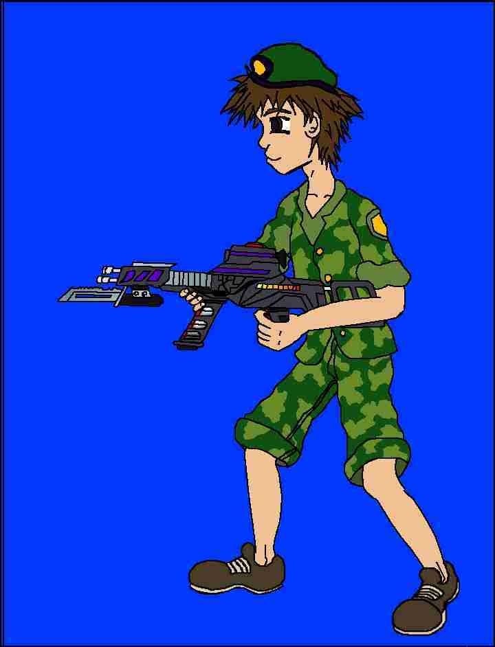
Step 3: Ink and do basic coloring of each layers corresponding parts

This means what it says, if the layer is called head, do the head and just the head. Where do you start, where do you stop? That takes artistic observation, if you’re drawing a human take time to examine yourself. Go look in a mirror and notice how each point of your body can pivot about certain places these are the places to start/stop, the elbow to the wrist for example, where the elbow represent the pivot point of the forearm.

To color the layers in, first INK the layer and then color them in with only the most basic of colors you plan on using (If you don’t like how the colors mix you can use the magic wand tools in the program to select those areas later and then use a hue/saturation/lightness effect located somewhere in the program to change the color to one more suitable to your desires).
FKA Pascal
User avatar
Dante
 
Posts: 1323
Joined: Thu Mar 04, 2004 8:24 pm
Location: Where-ever it is, it sure is hot!

Postby Dante » Fri Jan 04, 2008 7:15 pm

Tips for coloring

1. Use the fill bucket to fill large selections at once, using the magic wand tool to select the inked off areas you want to fill.
2. For area that are open at one end (making the wand tool and bucket difficult to use) first use a paint brush to isolate those areas using the color you want to fill it in with and then use the paint bucket/wand.
3. For areas like the arm or knee create rounded ends that extend up into the area into the other element. This way when that segment is moved or rotated it will give the effect of a smooth stretching rather then a cutoff edge :). Don’t make the diameter of these circles/smooth forms greater then the element above it.
4. Always draw into areas of the picture you can’t see… In other words, even though you didn’t draw it, always continue the back arm in its layer so that if rotated it can come out from BEHIND the person ;). Draw each element in its entirety whether visible in the original drawing or not.
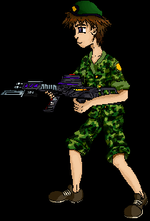
(Remember to save in a layer able format!)

Image
Sample Image 4

Step 4: Add the details!

Once you’ve gone through the job of doing the basic inking and drawing your image should start to have form basic though it is. Now is where you’re image and mine will REALLY start to deviate and artistic judgment majorly comes into play. Remember how I said to fill each segment with only ONE tone, there was a reason. Now, you can choose to say add shade and color change from shadows or inks present in the image. Simply go back to each layer use the magic wand tool to select the region of color you want to add a variant of color to and then use the paint brush to add the paint in. Because the area is selected you can’t color outside the lines! IT’S FORBIDDEN BY THE PROGRAM! (Someone should really forbid me to get my hands on the caps key lol).

Tip for adding shadows (USEFUL WHEN THERE ARE LOTS OF DIFFERENT INK COLORS FOR CLOTHES)

The best way to draw shadows is to simply color each of the tones and inks by hand in the shading section and then after this is completed create a layer over each layer. Then select the areas you want to shade in the layer below it, SWITCH (DON’T FORGET) to the corresponding shadow layer again and draw the shadows in as a black or dark purple or blue (NEAR BLACK). This should look really ugly because no shadows are really this black. The trick though is to switch the layer style to darken and then adjust the opacity till each layers shading looks right. This can (for a quick fix) rapidly decrease the amount of time drawing because it shades several elements at once and the shadow is one continuous drawing! This is especially useful when lots of coloring is present in the picture because the shadow creation time for these colors would take forever, just use this effect and reduce the process (it makes it look like you took hours to get the shading done when you really only spent a few minutes doing it). The effect can be repeated with the use of multiple layers to “transition” the shadows as well. Best of all, when all the shadows are done you can change the opacity meter or layer style to see if another darkening scheme makes the picture fit your tastes better!

TIP:

1. Do the shading after you’ve colored the picture in and do it all at once.
2. Choosing to keep your shadows all the same color can result in lighting consistency and reduce the time in searching for the right color.
3. Keep all shadow layers of the same type at the same layer style and opacity for consistency.
4. Remember your light sources! Always remember to draw all your shadows as if they are coming from the same source (common artist mistake, meh many often sadly look over it… including me). Also remember if you really want to go the extra mile, that light can come from reflections from the ground and from above… Ok so maybe that’s getting to deep, but it’s a cool thought for theory right?
5. Try this with bright spots too, and not just shadows using the lighten or linear dodge layer settings instead!

When you’re finished with all you’re shadows and bright spots be sure to flatten the respective section together so that a top front arm is only a top front arm and not a top front arm and respective top front arm shadows :P. (Don’t completely flatten though, just recreate the schema from before). Oh and don’t forget to rename them to their original names because these are likely to be lost. These names are really useful for selecting parts in the animation process.


Tips for Coloring

1. Remember to make sure the layer your on is the layer you want to draw on.
2. When drawing patterns on clothing or hand drawing shadows on skin, go through and edit all elements where that color is applied at the same time avoiding the hastle of having to re-find the color.
3. Make sure to color into areas you can’t see in this frame as well, remember to shade the entire object and not just what can be seen now (we’ll see it later when we animate it). Make the above layers invisible should they get in the way.
4. CTRL + Z… A computer users best friend!

(Remember to save in a layer able format!)

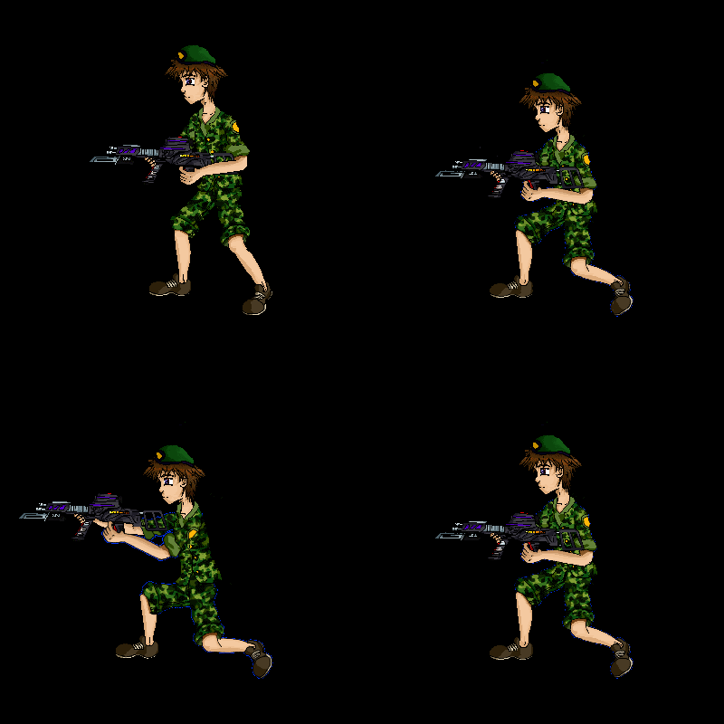
Image
Sample Image 5

Step 5: ANIMATE!

Now for the part that we’ve gone through all the trouble for ANIMATION! Every time you make a new frame you’re going to have to create a new Bitmap called a frame. Give it a naming scheme so you can easily access each image. For instance, Soldier Male Shoot 1. Note, the word frame isn’t necessary but may help to distinguish each image, but the character name or item name and the action occurring is absolutely necessary, especially for multiple path animations… yes you can cause your character to jump, or run, or shoot or even die, as many times and in what ever order you please once these frames are created… the joy of true game art awaits!

The trick is simply to move each limb or element to the place you want it to be and rotate it to the desired angle for each frame. You want as many frames possible to reduce the amount of jumpiness in the animation, and you want it to be smooth. Each rotation and movement is part of a greater set of movement that occurs in animation. Also note, that each frame will likely take up a lot of space and running the frames in your game will take up RAM, thus you don’t want TOO many frames (This can be confusing too because one part may appear to take too long and the other too short) I’d recommend about 8-12 max for animation with this technique. Also note that each rotation causes hideous pixilation as the computer makes its less then perfect rotation approximations (shutters), so this is another reason.

Now, if you may reach points where you rotate a limb or object and find to your horror that there is a chunk of white space formed where there should be an arm or leg… Don’t worry this can be easily fixed by zooming in and painting that frame segment by hand. Its far less then having to redo the entire frame! This should also have been reduced by the round ends tip in step 3 tip 3.

Also note that all the rotations will cause the elements to get fuzzy… this is pixilation, our worst enemy. But that is why I had you create this image so large! When you do pull this into the game you’re going to likely resize each character so they look to be the relative sizes you want which will be FAR smaller then the current size. When this happens much of this fuzz will disappear and it will even make it look like you spent hours pixel by pixel drawing the image.
FKA Pascal
User avatar
Dante
 
Posts: 1323
Joined: Thu Mar 04, 2004 8:24 pm
Location: Where-ever it is, it sure is hot!

Postby Dante » Fri Jan 04, 2008 7:22 pm

Also, I recommend adding another bright green, pink or blue background behind the character during the animation process and giving your canvas room extra space on the top and bottom of the picture during animation. The background makes an easy way to set a transparent color for each frame allowing one to ONLY have the character and not all that white space around them (White can be transparent, but white is useful for things like highlights and eyes so it’s a bad color to use, really ugly bright colors hard on the eyes are better for this purpose). Another idea is to use the background color over which the character or object is most likely to be seen. That way any feathering effects won’t give a bright blue hint or pink hue to your character when imported.

Overall though, a must do is to reopen each frame once they have all been created and select that background choose and with a magic wand tool over and over again until everything BUT the character is selected. The goal here is to select those “feathering pixels” that would be light pink or blue if these colors were used as the background (white is no better and even a standard back color can be just about as bad). Then once you’re satisfied that the magic wand has chosen just all the bad colored pixels add the pure background color on top once again in this selected region resulting in a solid segment of color easy for picking off transparent in the game!

Oh… that’s it, have fun animating!

-Pascal
FKA Pascal
User avatar
Dante
 
Posts: 1323
Joined: Thu Mar 04, 2004 8:24 pm
Location: Where-ever it is, it sure is hot!

Postby Dante » Fri Jan 04, 2008 7:34 pm

(This animation tutorial brought to you by the First Annual January Game Art Contest of 2008!)

got here for more information!:
Game Art Contest
FKA Pascal
User avatar
Dante
 
Posts: 1323
Joined: Thu Mar 04, 2004 8:24 pm
Location: Where-ever it is, it sure is hot!


Return to Tutorials

Who is online

Users browsing this forum: No registered users and 35 guests